‘The Quest’ for iPad: organising content
See also: ‘The Quest’ for iPad: why?, ‘The Quest’ for iPad: the team.
So how the heck am I going to condense these eleven years of work for ‘The Quest’ and that sizable amount of content (3,500 photographs directly related to evictions, at least 18 different evictions) into a digestible package? The fact that it is going to be for an iPad takes away some limitations. The most important being that an iPad gives the opportunity to provide more content than, say a normal coffee table book. A maximum amount of pictures for a book would be what? Somewhere between 80 and 120 pictures? Beyond that it isn’t physically manageable. It becomes too thick, costs too much to produce, to ship.
The iPad’s limitation in content is the total file size of the iApp. It seems there is a common rule that about 400Mb is the way to go and not much beyond. It already takes ages to download for those with limited connection speeds, and it eats a big chunk out of the storage capacities of the tablet. But 400Mb is a LOT of content (about 1,600 JPG’s at the iPad’s screen size).
Personally I like much content. It gives me the opportunity to explain better, to provide more background info, to differentiate seemingly similar situations. After all, to provide in-depth information you can’t have access to when working on a story during short visits is one of the reasons I settled in Cambodia. Digging in and squeezing strong…
The downside of a lot of content is that it better be organised properly so that it all still makes sense and that the reader doesn’t get lost. You need a clear scenario. On the other side you don’t want to drown the reader x 1,600 pictures.
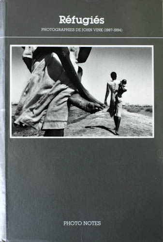
So before even thinking about trimming down the number of pictures, on deciding if I select pictures where form prevails upon content or the other way around, I started thinking about the organisation of it all. One way of dealing with it is having a chronological organisation: first story first, last story last… Another could be geographical. Or having a thematical organisation, like I did for the ‘Refugiés’ book: disruption, habitat, food aid, health, education, culture etc…
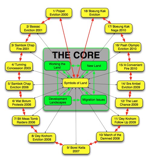
In the case of land issues in Cambodia, it made more sense to keep a chronological organisation, because eviction techniques and the response to them have changed over the years, even if some situations would be overlapping in time. An interesting side-effect is that some evictions being bigger or better documented than others, it results in ‘chapters’ of different length, which makes swiping through all the pictures less repetitive, create a change in rhythm, provide breathing spaces…
This thought process about organising the content for ‘The Quest‘ has to be combined with thinking about the interface. How do you go from one chapter to another, how do you go back to where you came from? But more on that later…
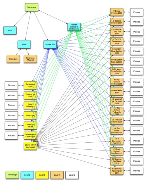
Having sequenced the stories it turned out that a few of them were redundant. A good occasion to trim down the content and weed out he weakest. What is left during this process reflects a wide scope of different types of evictions or land issues. Now I have a set of boxes I can drop the appropriate pictures into.
Another thing which came to light was that more background information was needed to put the evictions into perspective. Where does it come from? How does that work having land in Cambodia and cultivating it? What does possessing land mean? What are the social consequences of losing land? What happens with the land once it was expropriated? Right: time to check the archive and delve up a whole new set of pictures which were not taken with the land issues story in mind.
Here are a couple of organisation charts I played around with at the early stages (back in July) and which I turned out using only partially (sorry for the flashy coulours…):
Next post on ‘The Quest’ for iPad: editing the pictures


