‘The Quest’ for iPad: navigation and interface
See also:
‘The Quest’ for iPad: why?,
‘The Quest’ for iPad: the team,
‘The Quest’ for iPad: organising content,
‘The Quest’ for iPad: about editing,
‘The Quest’ for iPad: some more editing considerations and organising it,
‘The Quest’ for iPad: additional content and first hints on navigation
Right from the early stages when we started talking about ‘The Quest’ back in June and simultaneously with the organisation of the content, Robert Starkweather and I agreed to keep the UI (user interface) simple and consistent. Seems obvious, but you always have to keep in mind that minds roam freely. They go places you didn’t expect. They drift away. Or they tell their finger to tap stubbornly somewhere on the screen where nothing will happen. It is up to us to find out the reasons why this happens. We want happy fingers, tapping and sliding along merrily without ever being lost or taken to a dead end.
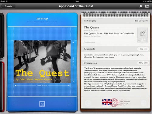
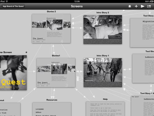
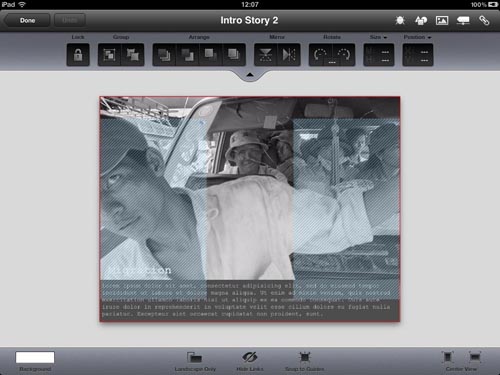
Robert S. came up with a first navigation concept based on the structure of the content. As I said before, I am not a developer. But there are developers to help those who cannot develop. While Robert was working on his side, I discovered a small application called ‘App Cooker’ that allows one to put together a dummy on the iPad. It has been extremely helpful and allowed me to sort out navigation and UI issues. It lets the user define ‘hot zones’, right on the iPad, which trigger certain actions, be it hiding or showing captions, moving to the next page, etc. AppCooker only produces a dummy. It can be sent over to the developer so that he can translate all this into code. But in our case Robert S. and I used the air conditioning at Java café more often to discuss about navigation issues.

AppCooker has several modules for each project. One for the organisation and interactivity, one for creating the icon and one for calculating how much money you'll make!
Decisions about how and when to show the caption, how and when to give access to the menu, to define the content of that menu, were more or less outlined at that time. When do we give access to Robert Carmichael’s writing, and what part of it? Should it be mixed with the photographs? No: when you are reading text you want to continue reading text and not be distracted by reading photographs. But access to the text should still be possible at any time, and the other way around. Do we show the captions during the slideshow? No: there is no time to read them, so it is useless. Do we add sound in the view per view mode? No: that would be better in the slide shows because you can’t control the time people stay on one picture. What kind of gestures shall we use: tapping, swiping, double tapping, and which function should they have?
Each gesture should have only one function, and again: if we can achieve the same with fewer buttons or gestures that is better. So no double tapping. Tapping once is only for access to things that are not on the screen or to hide them (show a caption, show the menu, trigger a menu function, select a story, go from a picture in the thumbnail view to its larger sized version, etc.) Swiping is only for navigation on the same level (go to the next or previous picture, scroll down the text). You don’t want to be fancy with navigation.
Another important asset so as not to get lost: always provide the possibility to go back exactly where you left off, like switching in the middle of a series of pictures to the text, and then going back to the picture you left.
It all sounds obvious, but it is only possible with a coherent content structure. Content rules, and as I told you before: I am a content guy…

